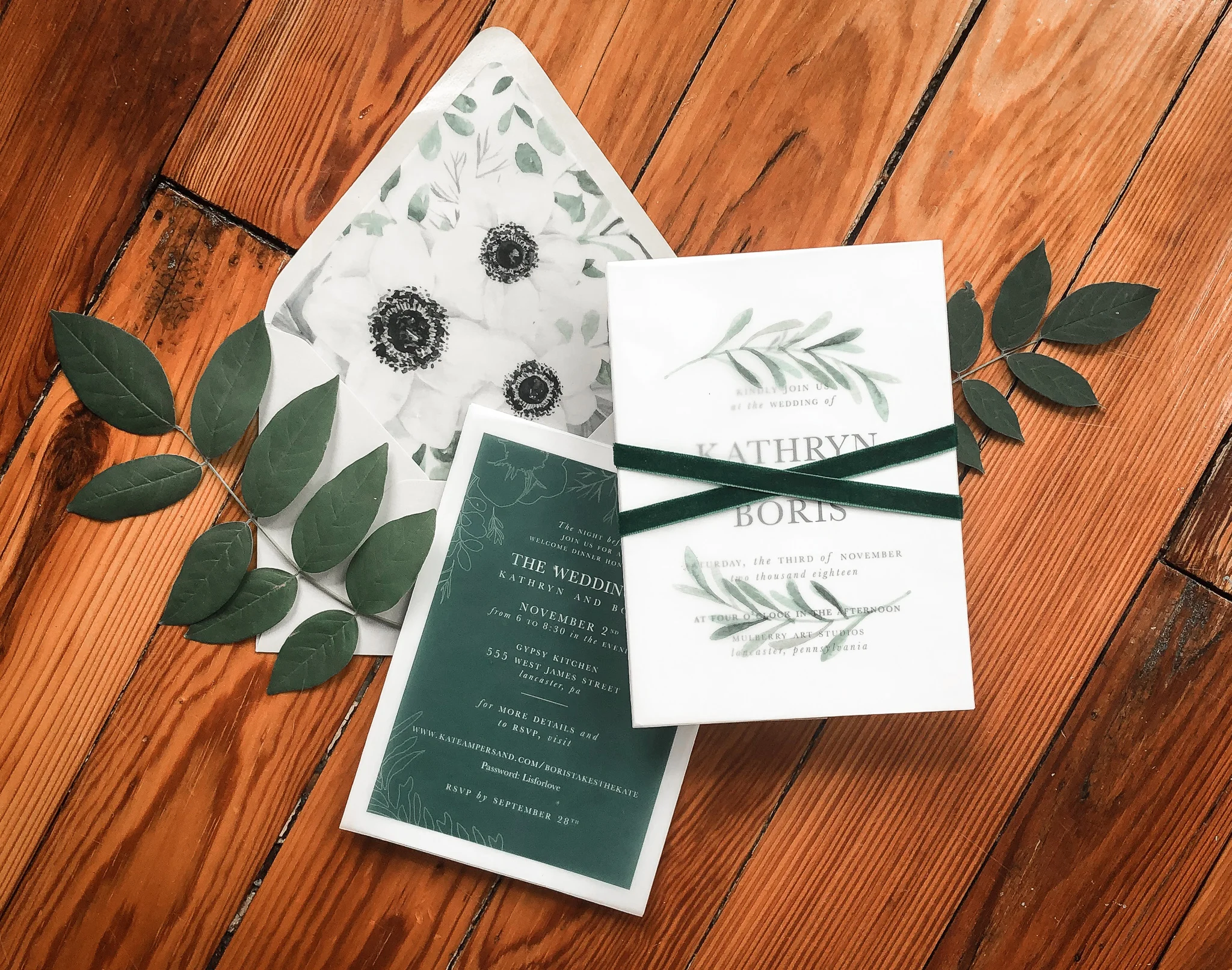
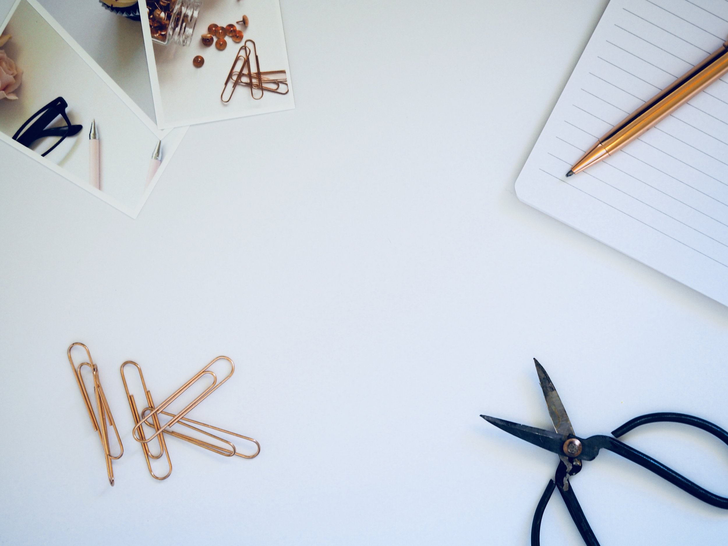
If you follow my instagram, you know that I have started to photograph my own custom wedding invites. You also know that I have honestly shared just how hard these shoots are! Flat lays, the term for this kind of shot, are really, really hard. Why? Because you have to climb up and over top of the layout to get the shot, create visual depth, style, crop and align every last detail. Don’t get me wrong, it’s fun, but it is not an easy thing to do. In the last few shoots, I have learned a lot.
So here are 7 things to help you create the best shots of your wedding invites, OOTD, that killer brunch the waiter just served, or anything you want to style and shoot from above.
1. pin it to win it
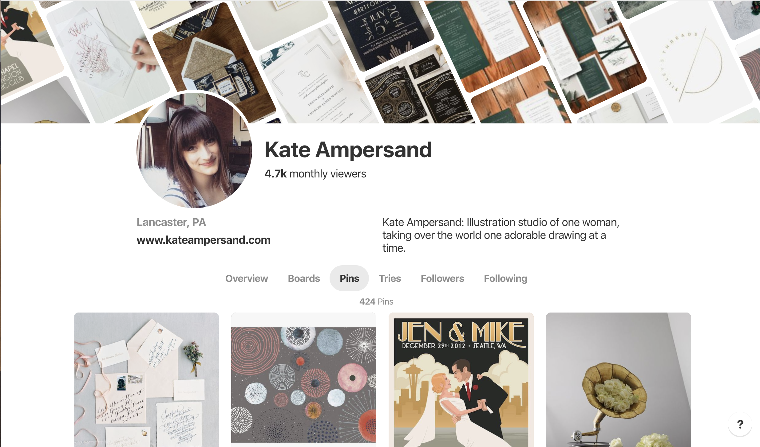
Pinterest is your best friend.
Find anything and everything that inspires you and pin it! This will help to get a sense for how you want to style your shoot. Consider the details used, textures, and angles. If you pin enough you will start to see trends in some of your inspiration and then you can start to collect the things you need to style your shot.
2. lighting is everything
This honestly is the most important thing you need in the mix. Find a big bright window and try to shoot at a time of day when you get the most light. Windows help to cut down on shadows and provide even lighting across your layout. Especially if you are taking your photos with a phone, it’s important to have good lighting in your shot before you edit. Crisp white light will help build a foundation for your styling to stand out!
3. style the details
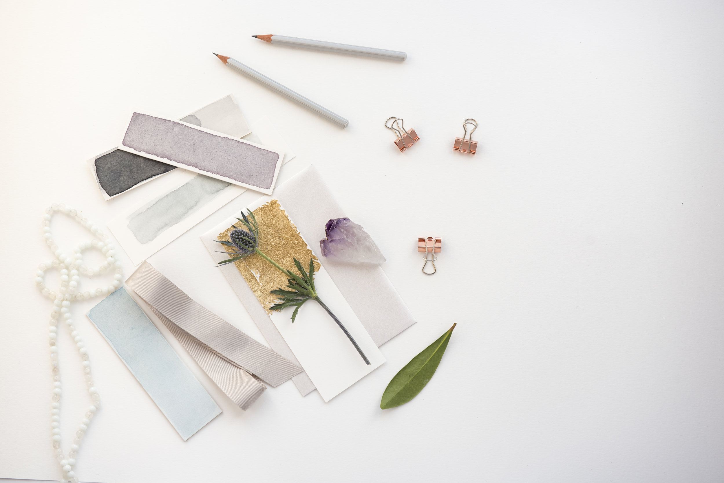
My favorite part of the setup is finding things to style the shoot. Crystals, ribbons, flowers, anything and everything that support the layout and design. Some people like to add in tools like scissors and ribbon with an invitation suite, or a spoon and sugar cubes to go with the perfect styled breakfast. Mix and matching organic with geometric and adding elements into the composition that add color are great ways to create a balanced design.
4. ask for feedback
It really does help to get some feedback. If you have friends that are into photography, they can be a huge help. Other people like savvy social users, marketers or anyone you think has good taste can provide food for thought when you are in the midst of shooting.
5. take your time
With any creative process, you should take your time. The more time you take and the more minor tweaks you can make to your layout, the more options you will have when you go through selections. It might take time before you have added and removed all of the props you want to use. I rotate out at least 10-12 details around my layout to make sure I have enough variety. Before I’m done shooting, I might even send a few of my favorites to a few friends to weigh in. It helps to slow my process down and look at what I’ve done before I wrap up.
6. find or create lightroom presets
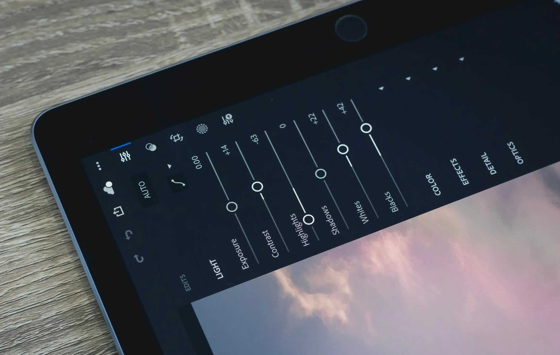
With lightroom, there are free resources online for presets to import. You can then take those presets and adjust them from there. Once you do that, you can apply that preset to all of the photos you’ve selected for a consistent look. If you don’t have lightroom, you can try it for free or there are other apps you can use.
VSCO, BeFunky, or Fotor are a few others that you can use for free or upgrade for more capabilites.
7. get creative
Don’t be afraid to try it all. There is no wrong way. The more you add, remove, angle, style and shoot, the more variations you will have to make selects from and the better you will get at styling to your taste! Anything can be a prop, even empty jewelry boxes. hint: I actually use those to prop up parts of the flat designs to add depth. Let go of what you think it should look like and let your favorite pins guide you, not dictate the vision.
For more examples, take a look at my work section and be sure to follow me on social. Links in the footer!
